
Color Defines the Moment
After a recent trip to Portugal, someone asked if I had brought home a souvenir.
At first, the answer felt simple: no.
But later, it became clear that I had—just not in the way we typically expect.
What I brought home were impressions, held not in objects, but in color.
Faded blues layered against weathered stone. Terracotta rooftops warming as the sun began to fall. Soft ivory facades catching the morning light and carrying it through narrow streets and quiet cafés. Even now, these are the first things that return. Not the itinerary. Not the conversations. Not even the photographs.
Color arrives first.
Perhaps that is one of its most understated yet powerful qualities: color remembers for us. It holds the atmosphere of a place or moment long after the specifics begin to dissolve.
We often think of color as decorative—something applied. But in reality, it is far more intrinsic. It becomes embedded in experience itself. Over time, details soften. Edges blur. Yet color remains remarkably intact.
We remember the deep green of a dining room long before we recall the furniture within it. A pale blue bedroom before its layout. The golden cast of evening light before the day that held it.
Color defines the moment.
Not overtly. Not urgently. But with a quiet consistency that lingers.
This is where its role in interior design becomes far more significant than a surface-level decision. Color is not simply aesthetic; it is atmospheric. It shapes how a space is perceived, but more importantly, how it is felt.
A room washed in soft green can create an immediate sense of calm, almost without explanation. Deeper, layered tones draw people inward, encouraging stillness, conversation, or retreat. Neutrals, when thoughtfully composed, carry a sense of ease that feels both refined and entirely unforced.
These are not dramatic gestures. They are subtle calibrations.
And yet, they determine the emotional register of a space.
The most compelling interiors rarely rely on a statement alone. Instead, they unfold gradually—through nuance, proportion, and the relationships between tones. What appears effortless is often the result of careful consideration.
This is where understanding color becomes less about selection and more about sensitivity.
A single shade can shift entirely depending on its context. A blue that feels expansive in daylight may flatten by evening. A neutral that appears warm beside natural wood can cool against stone or metal. Light, materiality, and texture—each element informs the next.
Color does not exist in isolation. It is always in dialogue.
The interiors that feel enduring—those that resonate long after a first impression—are often grounded in this layered understanding. Their palettes are not incidental; they are composed. Built with intention. Adjusted with restraint.
They allow space for light to move. For tones to deepen. For the atmosphere to evolve throughout the course of a day.
And while these decisions may not always be consciously recognized, they are undeniably felt.
That is the distinction.
People may not be able to articulate why a space resonates with them, but they know when it does. They remember how it felt to be there.
Long after pieces are rearranged, or styles shift, what remains is the imprint of the space itself—its warmth, its stillness, its sense of ease.
And more often than not, it is color that carries that impression in the first place, quietly defining the moment and, in doing so, shaping what we remember long after.
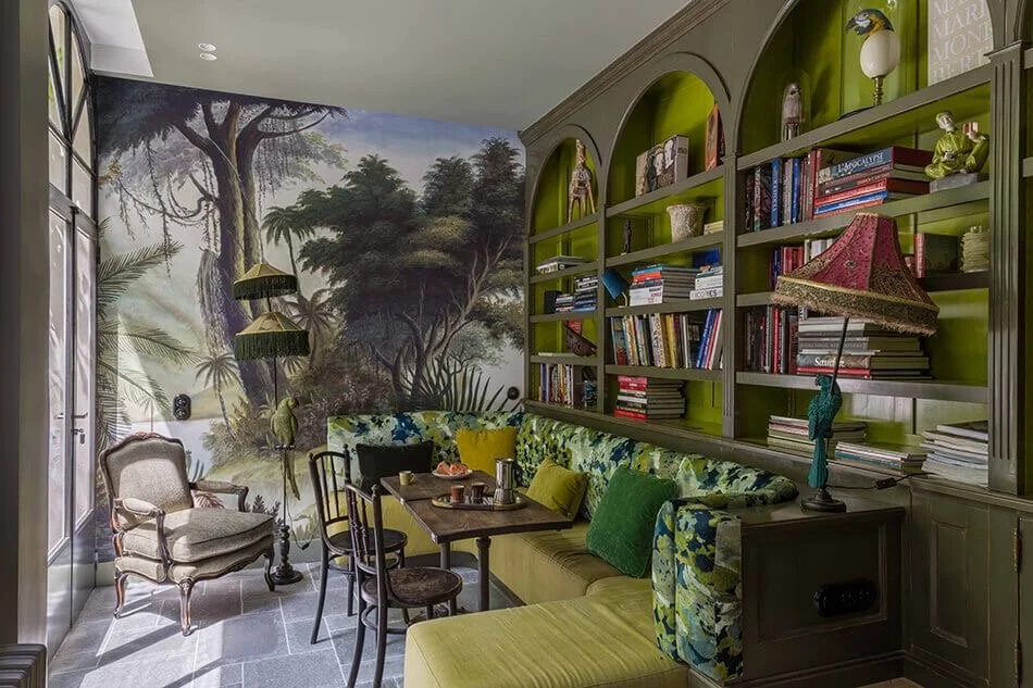

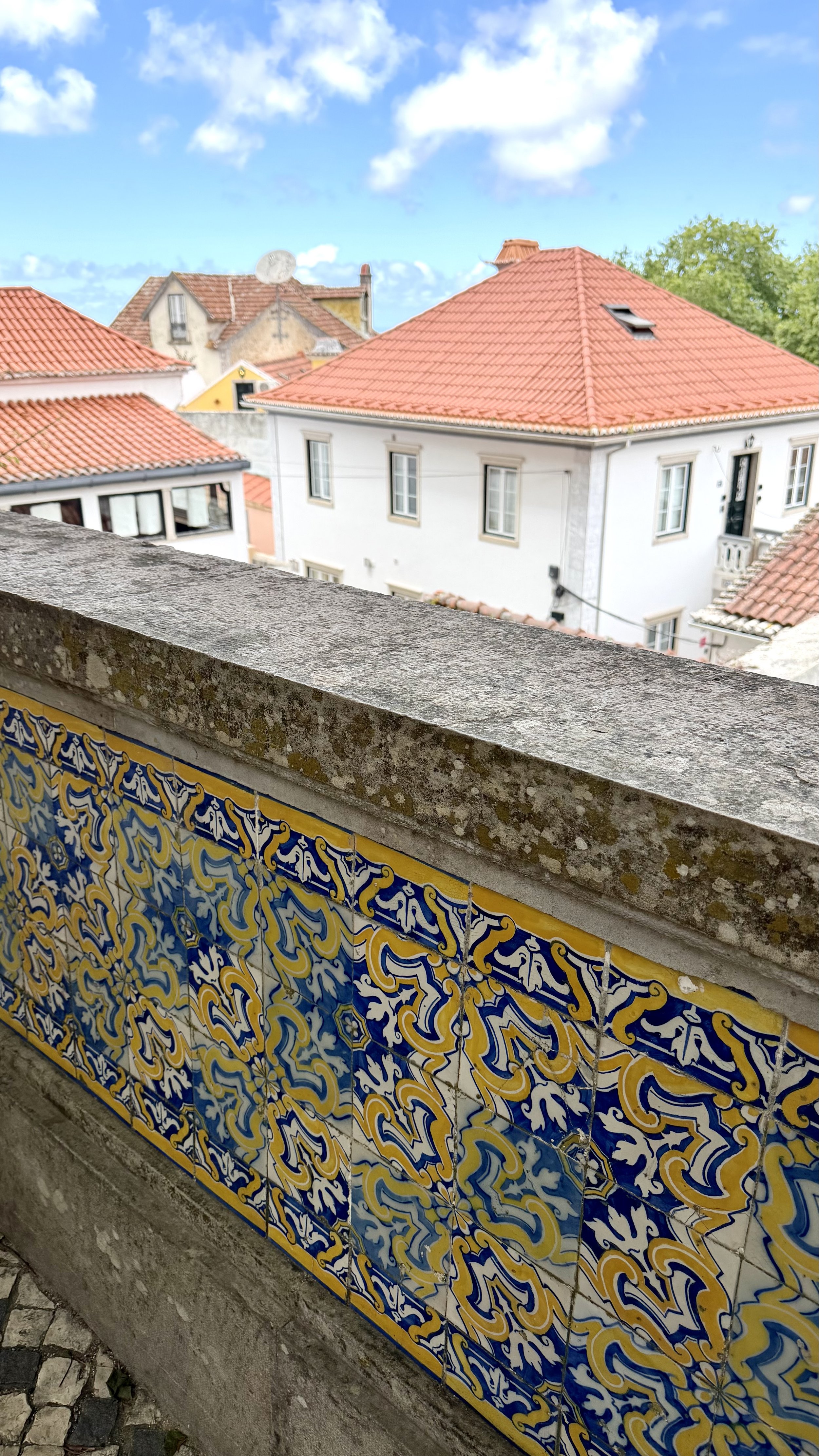
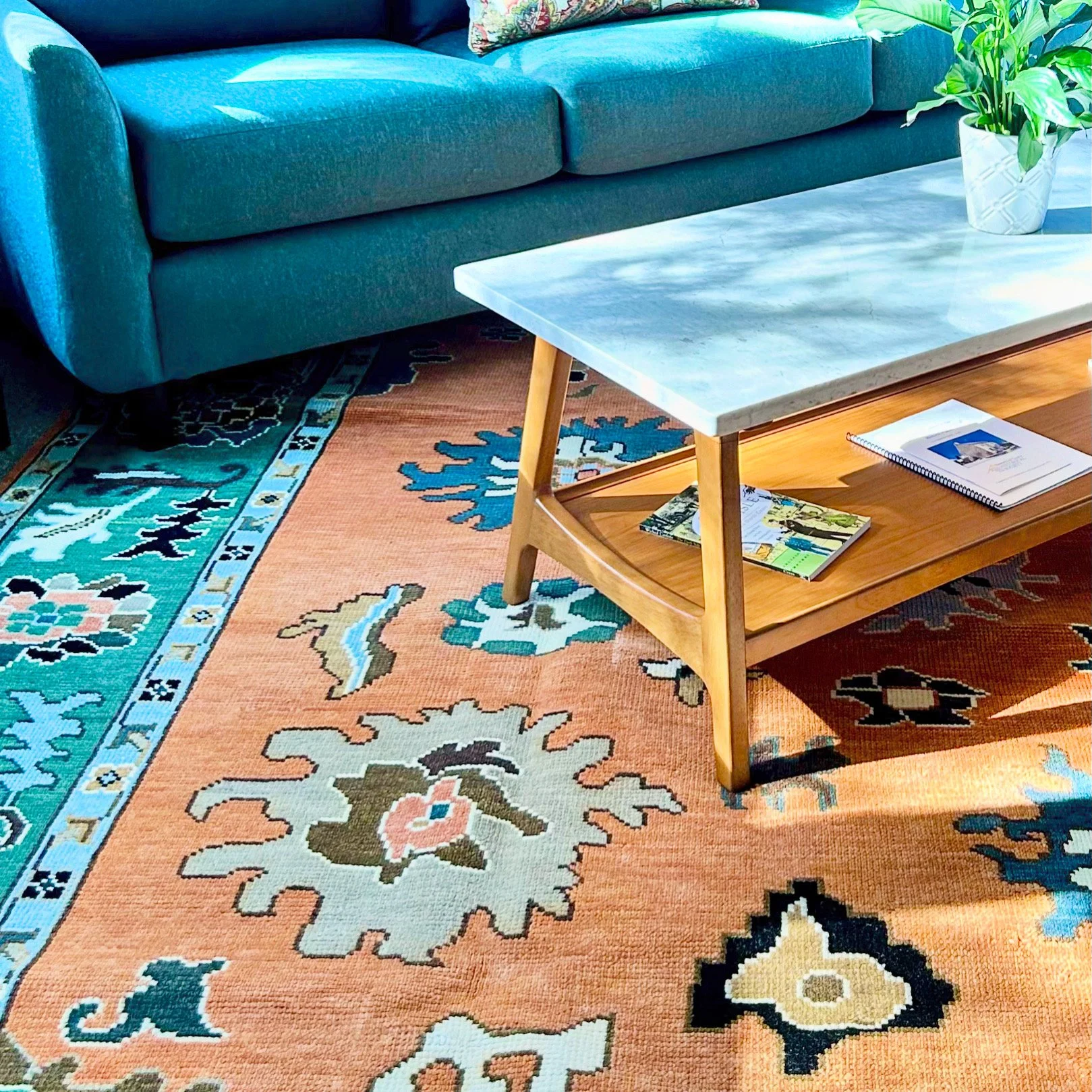
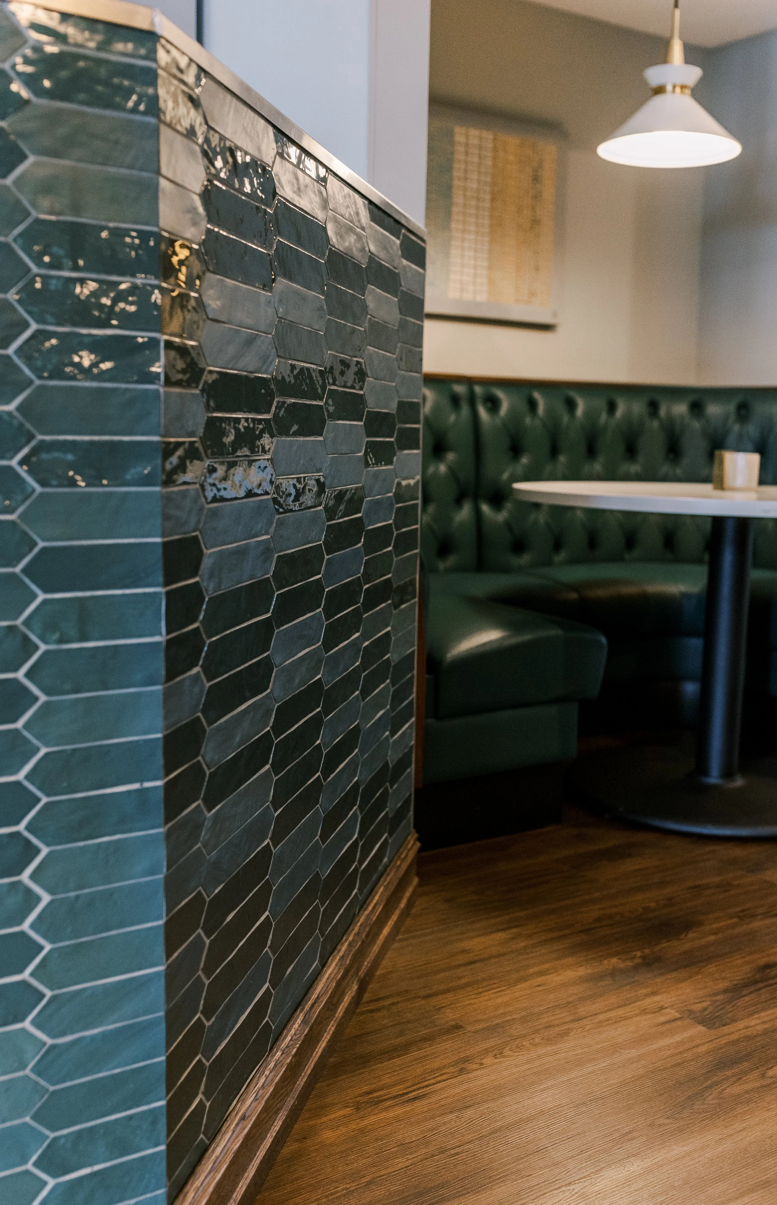
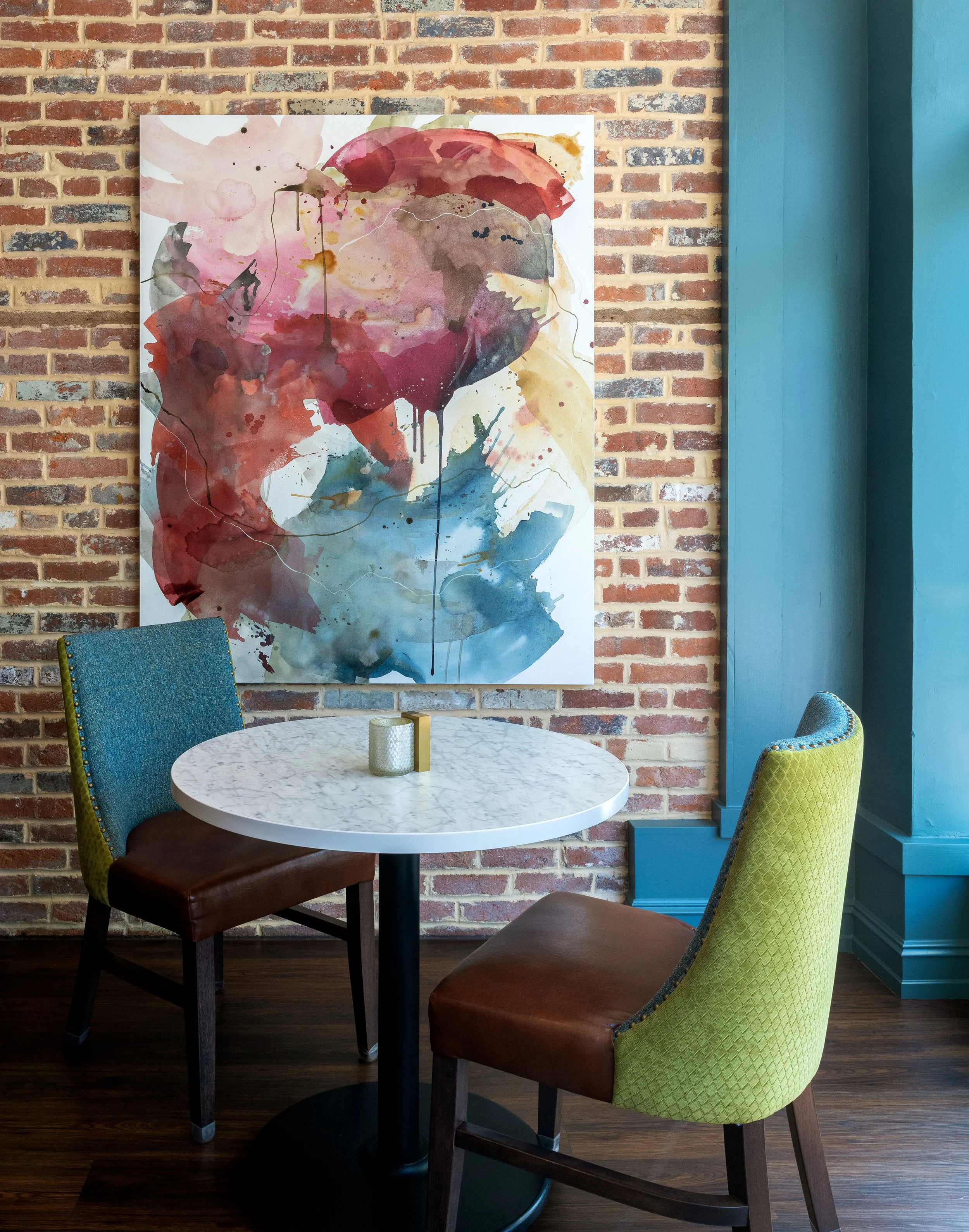
Photo Credit (top left, image one): https://www.instagram.com/moissonnierkorea/